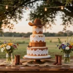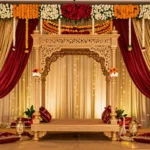
Fall weddings offer some of the most stunning color opportunities of the year. We’re talking about rich burgundies warm golds and deep forest greens that create breathtaking backdrops for your special day. The autumn season naturally provides a palette that’s both romantic and sophisticated making it easier than ever to design a wedding that feels both timeless and on-trend.
When we think about fall wedding colors we immediately envision the gorgeous transformation happening all around us. From burnt orange maples to deep plum sunsets nature serves up endless inspiration for couples planning their autumn celebration. These seasonal hues work beautifully whether you’re planning an outdoor ceremony surrounded by changing leaves or an elegant indoor reception.
The best part about choosing fall colors? They photograph beautifully and create that cozy intimate atmosphere every couple dreams of. We’ve gathered the most stunning fall wedding color palette ideas that’ll make your guests feel the magic of the season while celebrating your love story.
Classic Autumn Hues: Deep Burgundy and Gold Combinations
Deep burgundy and gold represent the quintessential fall wedding color palette that captures autumn’s natural elegance. These timeless hues create a sophisticated foundation that works beautifully across every wedding element.
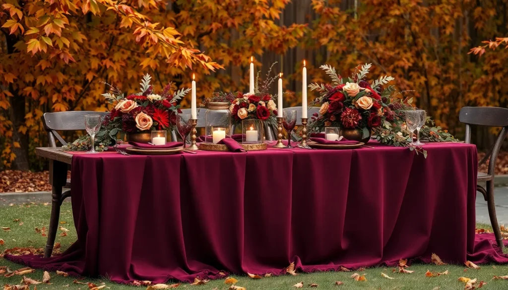
Rich Burgundy as Your Primary Color
Burgundy serves as the perfect dominant color for fall wedding celebrations because of its rich depth and versatility. We love how this sophisticated shade appears in everything from bridesmaids’ dresses to floral arrangements, creating a cohesive look throughout your special day. Darker burgundy tones work exceptionally well for evening ceremonies, while lighter burgundy shades bring warmth to afternoon celebrations.
Floral arrangements featuring burgundy dahlias, roses, and peonies create stunning centerpieces that photograph beautifully against autumn backdrops. Burgundy bridesmaid dresses in flowing chiffon or elegant satin fabrics complement the season’s romantic atmosphere. Table linens in deep burgundy velvet or silk add luxurious texture to reception spaces.
Stationery elements in burgundy create elegant first impressions through invitations, menus, and place cards. Burgundy candles and napkins provide subtle color reinforcement without overwhelming your tablescape design.
Antique Gold Accents and Metallic Details
Antique gold accents elevate burgundy wedding palettes by adding warmth and sophistication to every design element. We recommend incorporating gold through metallic charger plates, vintage brass candlesticks, and delicate gold-rimmed glassware. These metallic touches catch light beautifully during both indoor and outdoor celebrations.
Gold jewelry for the bridal party creates cohesive styling that complements the overall color scheme. Antique gold picture frames for table numbers and memorial photos add personal touches while maintaining the elegant aesthetic. Metallic gold ribbons on bouquets and boutonnieres provide subtle shimmer without competing with floral beauty.
Lighting fixtures in warm gold tones create romantic ambiance through string lights, lanterns, and chandeliers. Gold foil details on wedding invitations and programs add luxurious finishing touches to paper goods.
Incorporating Cream and Ivory Neutrals
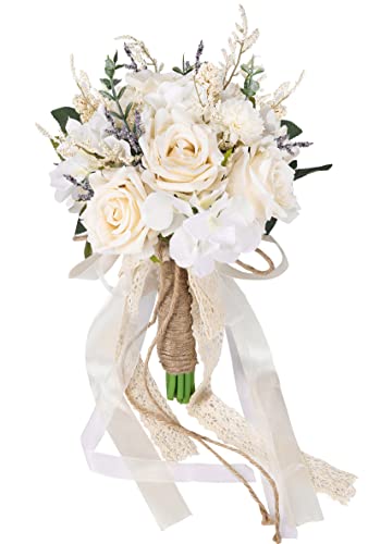
Cream and ivory neutrals balance the intensity of burgundy and gold while creating visual breathing room in your color palette. We suggest using these soft tones through bridal gowns, ceremony backdrops, and foundational decor elements. Ivory table runners over burgundy linens create beautiful layered looks that feel both elegant and approachable.
Cream colored flowers like roses, hydrangeas, and chrysanthemums soften bold burgundy blooms in bouquets and centerpieces. Neutral bridesmaid dresses in champagne or blush tones provide gentle contrast while maintaining palette cohesion. Ivory candles in gold holders create romantic lighting that enhances the warm atmosphere.
Wooden elements in natural cream tones through ceremony arches, welcome signs, and rustic accents bring organic texture to your fall wedding design. These neutral foundations allow burgundy and gold elements to shine while creating a balanced, sophisticated aesthetic.


Warm Earth Tones: Terracotta and Sage Green Pairings

Exploring earth tones for fall weddings opens up endless possibilities for creating sophisticated palettes. We’ve discovered that terracotta and sage green create one of the most stunning combinations for couples seeking a modern yet timeless aesthetic.
Terracotta Orange for Bold Statement Pieces
Terracotta brings vibrant warmth to fall wedding designs through its rich orange undertones. We recommend incorporating this bold hue in bridesmaid dresses to create a striking visual impact that photographs beautifully against autumn backdrops. Floral arrangements featuring terracotta blooms like marigolds, dahlias, and chrysanthemums add depth to centerpieces while maintaining seasonal authenticity.
Table runners in terracotta silk or linen create dramatic focal points that draw guests’ attention to your reception tables. We’ve seen couples use terracotta pottery as unique centerpiece vessels, adding texture and rustic charm to their tablescape design. Accent lighting in warm terracotta tones enhances the cozy atmosphere that makes fall weddings so memorable.
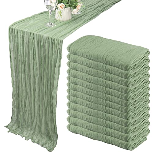
Muted Sage Green for Natural Balance
Sage green provides the perfect calming counterpoint to terracotta’s boldness through its soft, muted tones. We suggest incorporating this natural hue through eucalyptus garlands that drape elegantly across ceremony arches and reception spaces. Table settings featuring sage green napkins or charger plates create sophisticated place settings that complement earth tone palettes.
Foliage in various shades of sage green adds organic texture to bridal bouquets and boutonnières. We’ve observed how sage green bridesmaid dresses create a harmonious blend when paired with terracotta accessories like shoes or jewelry. Candles in sage green holders cast a romantic glow that enhances the natural beauty of outdoor fall ceremonies.
Adding Dusty Rose for Romantic Touches
Dusty rose introduces romantic softness that beautifully bridges terracotta and sage green elements. We recommend scattering dusty rose petals along ceremony aisles to create a dreamy walkway for the bride’s entrance. Lace details in dusty rose tones add delicate touches to table linens, invitation suites, and bridal accessories.
Candle arrangements featuring dusty rose tapers create intimate lighting that enhances the overall warmth of your wedding ambiance. We’ve found that dusty rose accent flowers like garden roses and spray roses complement both terracotta and sage green florals perfectly. Subtle dusty rose ribbons tied around sage green napkins or terracotta pottery add cohesive finishing touches that tie the entire palette together.


Jewel-Toned Elegance: Emerald and Plum Sophistication

Moving beyond traditional autumn hues, we discover sophisticated jewel tones that bring unparalleled richness to fall celebrations. This palette transforms ordinary wedding elements into luxurious statements through deep emerald green, rich plum purple, and champagne gold accents.
Deep Emerald Green for Dramatic Impact
Emerald green creates stunning visual drama as the trending color that’s perfect for making bold wedding statements. We recommend incorporating this rich jewel tone through bridesmaids’ dresses that photograph beautifully against autumn backdrops. Floral arrangements featuring deep green foliage like eucalyptus and magnolia leaves provide natural sophistication while supporting the overall color story.
Ceremony decorations benefit tremendously from emerald green elements such as velvet table runners and silk ribbon details. Linens in this striking shade create intimate dining experiences that feel both modern and timeless. Stationery designs featuring emerald green calligraphy or watercolor washes tie the entire aesthetic together seamlessly.
Bridal party accessories offer perfect opportunities to introduce emerald green through elegant jewelry pieces and delicate hair accessories. Shoes in rich emerald tones create unexpected pops of color beneath flowing gowns. Bouquet ribbons and boutonniere accents complete the cohesive look throughout your wedding party.
Rich Plum Purple for Luxurious Feel
Plum purple delivers sophisticated luxury that elevates fall wedding aesthetics beyond traditional seasonal expectations. Deep purple bridesmaid dresses create striking contrasts against lighter autumn foliage while maintaining elegant formality. Floral arrangements combining plum dahlias, deep purple roses, and rich orchids provide stunning centerpieces that command attention.
Table settings transformed with plum accents include napkins, glassware, and candle arrangements that create intimate dining atmospheres. Rich purple linens paired with gold charger plates establish luxurious foundation pieces for reception tables. Lighting effects using purple uplighting or colored candles enhance the overall mood and ambiance.
Invitation suites featuring plum elements set the tone for elegant celebrations from the very beginning. Wax seals, envelope liners, and calligraphy details in deep purple shades communicate sophistication to your guests. Programs and menu cards continue the color story throughout your ceremony and reception materials.
Champagne Gold for Refined Accents
Champagne gold provides refined finishing touches that elevate emerald and plum combinations to new heights of elegance. Metallic charger plates, candelabras, and flatware create cohesive table settings that feel both luxurious and welcoming. Picture frames, cake stands, and serving pieces in champagne gold tie together reception elements beautifully.
Jewelry selections in champagne gold tones complement the overall palette while adding subtle sparkle to bridal looks. Hair accessories, earrings, and delicate necklaces in warm gold shades enhance both bride and bridesmaid ensembles. Groomsmen accessories like pocket watches, cufflinks, and tie clips complete the coordinated aesthetic.
Floral arrangements enhanced with champagne gold details include spray painted branches, metallic ribbon accents, and gilded vases that catch candlelight perfectly. Ceremony arches decorated with gold elements create stunning backdrops for vows and photographs. Reception lighting featuring warm gold tones brings everything together in sophisticated harmony.


Rustic Charm: Burnt Orange and Navy Blue Contrast

This stunning combination perfectly captures autumn’s essence while maintaining year-round sophistication. We’ve discovered that this palette creates an irresistible balance between seasonal warmth and classic elegance.
Vibrant Burnt Orange for Seasonal Warmth
Vibrant burnt orange adds remarkable warmth and coziness to fall wedding atmospheres. This seasonal powerhouse works beautifully in bridesmaid dresses, creating stunning focal points that photograph exceptionally well against autumn landscapes. Floral arrangements featuring burnt orange dahlias, marigolds, and chrysanthemums bring natural seasonal beauty to ceremony altars and reception centerpieces.
Table linens in this rich hue transform dining spaces into cozy gathering spots that encourage intimate conversations. We recommend incorporating burnt orange through accent pieces like throw pillows on lounge furniture, ribbon details on invitations, and candle holders that cast warm glows throughout evening celebrations. Pumpkin and gourd decorations naturally complement this color choice, creating cohesive seasonal styling that feels authentically autumnal.
Deep Navy Blue for Timeless Appeal
Deep navy blue provides sophisticated contrast and timeless appeal that elevates any wedding celebration. This classic color anchors the palette with its versatility, working seamlessly in both outdoor and indoor settings. Groomsmen suits in navy create sharp, polished looks that photograph beautifully against burnt orange bridesmaid dresses.
Navy blue table runners and napkins add elegant depth to reception tables while maintaining visual balance with brighter orange elements. We love using this color in ceremony decorations like aisle runners, chair sashes, and backdrop fabrics that create dramatic yet refined atmospheres. Stationery featuring navy blue typography on cream backgrounds establishes sophisticated first impressions that carry throughout the entire wedding experience.
Cream White for Fresh Balance
Cream white offers fresh balance that helps blend navy blue’s boldness with burnt orange’s warmth. This neutral foundation prevents the palette from becoming overwhelming while adding lightness to the overall design scheme. Bridal gowns in ivory or cream create stunning contrasts against both burnt orange and navy blue elements.
Wedding cakes featuring cream white fondant with burnt orange and navy blue accents become artistic centerpieces that tie the color story together. We suggest using cream white in floral arrangements through white roses, peonies, and baby’s breath that soften the intensity of bolder colors. Linens in cream provide clean backgrounds that allow burnt orange and navy blue details to shine while maintaining elegant sophistication throughout the celebration.


Moody Romance: Dusty Blue and Mauve Combination

Romance takes on a dreamy quality when we blend dusty blue’s tranquil elegance with mauve’s warm sophistication. This enchanting palette creates an atmosphere that’s both serene and passionate for fall celebrations.
Soft Dusty Blue for Serene Atmosphere
Dusty blue establishes a peaceful foundation that perfectly complements rustic and vintage wedding elements. We love incorporating this gentle hue through bridesmaids’ dresses that photograph beautifully against autumn’s golden backdrop. Linens in soft dusty blue create calming table settings that encourage intimate conversation among guests.
Ceremony decorations benefit tremendously from dusty blue’s versatile nature. We recommend using this shade for aisle runners and draping that enhances both outdoor garden ceremonies and indoor chapel settings. Floral arrangements featuring dusty blue hydrangeas and delphiniums add sophisticated touches without overwhelming the romantic atmosphere.
Warm Mauve for Feminine Touches
Mauve brings feminine elegance that balances dusty blue’s cool tones with its warm undertones. We find this sophisticated shade works exceptionally well in bridal party accessories like shawls and bouquet ribbons. Table settings come alive when we incorporate mauve through napkins and centerpiece accents that tie the entire palette together.
Floral designs reach new heights of romance when mauve roses and peonies take center stage. We suggest mixing mauve blooms with cream varieties to create depth and visual interest. Wedding cakes adorned with mauve sugar flowers or delicate piping details become stunning focal points that guests remember long after the celebration ends.
Blush Pink for Delicate Highlights
Blush pink provides the perfect finishing touch that elevates this moody romance palette to breathtaking heights. We incorporate this soft hue through scattered rose petals along ceremony aisles and reception tables. Delicate lace details on wedding gowns and bridesmaid dresses gain extra dimension when paired with blush pink underlays.
Candle arrangements throughout the venue create magical ambiance when we use blush pink pillar candles alongside dusty blue and mauve elements. Reception lighting takes on a romantic glow when blush pink uplighting washes over dance floors and dining areas. These subtle highlights ensure the entire color story flows seamlessly from ceremony to celebration.


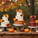
Harvest-Inspired Palette: Pumpkin and Mustard Yellow Blend

We embrace the warmth and vitality of autumn with this stunning harvest inspired combination that captures fall’s most celebratory colors.
Rich Pumpkin Orange for Festive Energy
Pumpkin orange delivers festive energy that transforms your wedding into a celebration of autumn’s abundance. We recommend incorporating this vibrant hue through bridesmaid dresses to create stunning visual impact against fall foliage. Floral arrangements benefit from pumpkin colored dahlias, marigolds, and chrysanthemums that echo the season’s harvest spirit.
Table linens in rich pumpkin tones add warmth to reception spaces while maintaining sophisticated appeal. We suggest using pumpkin orange napkins paired with neutral charger plates for balanced elegance. Ceremony decorations shine when you incorporate pumpkin colored ribbon accents on aisle chairs and altar arrangements.
Accent pieces in this bold shade create cohesive design throughout your celebration. We love seeing pumpkin orange candles clustered on tables for intimate lighting. Wedding stationery featuring pumpkin accents ties your color story together from invitation to thank you cards.
Golden Mustard Yellow for Cheerful Brightness
Golden mustard yellow provides cheerful brightness that balances pumpkin’s intensity with sunny sophistication. We recommend this warm hue for groomsmen accessories like ties, pocket squares, and boutonnieres. Floral designs benefit from mustard yellow roses, sunflowers, and billy balls that add textural interest.
Lighting elements in golden mustard create magical ambiance for evening celebrations. We suggest incorporating mustard colored glass votives and string lights for romantic glow. Lounge areas feel more inviting with mustard throw pillows and blankets for guest comfort.
Decorative touches in this sunny shade enhance your harvest theme without overwhelming other colors. We love mustard yellow escort cards displayed with mini pumpkins and gourds. Cake decorating becomes more ever-changing with mustard buttercream flowers and gold leaf details.
Forest Green for Natural Grounding
Forest green grounds this vibrant palette by connecting your celebration to autumn’s natural beauty. We recommend using this rich hue through eucalyptus garlands, pine arrangements, and moss accents. Groomsmen look distinguished in forest green suits or vests paired with lighter accessories.
Natural elements in deep green tones create organic flow throughout your venue design. We suggest incorporating forest green table runners made from velvet or linen for luxurious texture. Ceremony arches benefit from lush greenery that frames your vows against nature’s backdrop.
Accent details in forest green provide sophisticated contrast to warmer harvest colors. We love seeing green glass bottles used as vases for single stem flowers. Place settings feel more elegant with forest green charger plates and cloth napkins that complement your natural theme.


Sophisticated Neutrals: Taupe and Cranberry Coordination

Building upon the dramatic color combinations we’ve explored, sophisticated neutrals offer refined elegance that captures autumn’s essence without overwhelming the senses. This timeless approach to fall wedding design creates understated luxury through carefully balanced earth tones and seasonal accents.
Warm Taupe for Understated Elegance
Warm taupe establishes a versatile neutral foundation that complements every element of your fall celebration. This sophisticated shade works beautifully in bridesmaid dresses, creating an effortlessly elegant backdrop that photographs stunning against autumn’s natural industry. We recommend incorporating warm taupe through table linens and ceremony decorations to achieve cohesive visual flow throughout your venue.
Groomsmen accessories in warm taupe tones add refined coordination without competing with your seasonal color story. Taupe napkins and table runners create sophisticated table settings that allow your cranberry accents to truly shine. This understated color choice provides the perfect canvas for metallic details like bronze charger plates and antique gold candlesticks.
Wedding invitations featuring warm taupe backgrounds establish your sophisticated palette from the very first impression guests receive. Ceremony programs and menu cards in matching taupe shades reinforce your design aesthetic while maintaining elegant simplicity.
Deep Cranberry for Seasonal Color Pop
Deep cranberry brings vibrant autumn energy that perfectly balances taupe’s subtle sophistication. This rich seasonal hue creates stunning focal points through bridesmaid bouquets filled with cranberry colored dahlias and roses. We suggest using deep cranberry in table centerpieces to add dramatic visual interest without overwhelming your neutral foundation.
Cranberry colored ribbons and sashes provide affordable ways to incorporate this bold shade throughout your ceremony and reception spaces. Floral arrangements featuring deep cranberry blooms create striking contrasts against warm taupe linens and ivory ceremony backdrops. This vibrant color photographs beautifully in both natural outdoor light and intimate indoor settings.
Wedding cake accents in deep cranberry through fresh berries or fondant details tie your dessert presentation into your overall color scheme. Cranberry colored wine glasses or napkin rings add thoughtful touches that reinforce your sophisticated palette at every guest table.
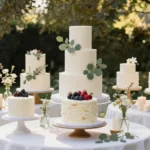
Ivory White for Classic Foundation
Ivory white serves as the timeless anchor that elevates both taupe and cranberry to their full sophisticated potential. This classic foundation color appears beautifully in your wedding dress while creating visual breathing room between bolder palette elements. We recommend ivory white in ceremony florals to add brightness and traditional elegance to your autumn celebration.
White and ivory candles throughout your reception space create romantic ambiance while reinforcing your neutral color story. Ivory table settings provide clean backgrounds that make your cranberry florals and taupe linens appear more vibrant and intentional. This foundational shade ensures your sophisticated palette maintains balance and avoids appearing too heavy or overwhelming.
Ceremony programs and place cards in ivory tones add elegant finishing touches that guests will appreciate. Ivory colored lighting through draped fabric or lampshades creates warm, inviting atmosphere that complements your sophisticated neutral palette perfectly.


Bold and Beautiful: Copper and Forest Green Partnership

Copper’s warm metallic tones paired with forest green’s natural depth create one of fall’s most stunning wedding palettes. This sophisticated combination offers the perfect balance of glamour and earthiness that defines autumn celebrations.
Metallic Copper for Glamorous Shine
Metallic copper adds a glamorous shine to your wedding decor that captures light beautifully throughout the day. Bridesmaids look stunning in copper-toned dresses that shimmer as they move down the aisle. Table settings come alive when you incorporate copper charger plates, candlesticks, and flatware that reflect the warm glow of your celebration.
Floral arrangements gain sophisticated elegance when wrapped with copper wire or displayed in copper vessels. Ceremony decorations sparkle when you add copper lanterns, vases, and accent pieces that catch both natural and artificial light. Wedding stationery becomes more luxurious with copper foil details, envelope liners, and calligraphy that sets an upscale tone from the first invitation.
Dark Forest Green for Rich Depth
Dark forest green provides rich depth that grounds your wedding palette in nature’s most beautiful autumn hues. Groomsmen create a distinguished look wearing forest green ties, pocket squares, or even full suits that photograph beautifully against fall backdrops. Centerpieces gain natural elegance when you incorporate deep green eucalyptus, pine branches, and ferns that bring the outdoors inside.
Linens in forest green create dramatic table settings that serve as perfect canvases for your copper accents. Ceremony arches become breathtaking focal points when adorned with lush forest green garlands and foliage arrangements. Bridesmaids’ bouquets look stunning when featuring deep green elements like magnolia leaves, rosemary, and sage that complement the metallic copper tones.
Champagne Beige for Soft Transitions
Champagne beige creates soft transitions between your bold copper and deep forest green elements. Neutral florals in champagne and cream tones provide visual breathing room that prevents your color palette from feeling overwhelming. Table runners and napkins in champagne beige offer elegant contrast that allows your copper and green accents to truly shine.
Bridal party accessories look refined when incorporating champagne beige shoes, wraps, and jewelry that tie the entire look together. Lighting becomes more romantic when you use champagne-colored candles and soft beige lamp shades that create a warm, inviting atmosphere. Cake decorations achieve sophisticated beauty with champagne buttercream, beige sugar flowers, and neutral ribbon details that complete your fall wedding vision.

Conclusion
Your fall wedding deserves a color palette that captures the season’s natural beauty while reflecting your unique love story. Whether you’re drawn to classic burgundy and gold combinations or prefer modern jewel tones with emerald and plum we’ve shown you countless ways to create the perfect autumn aesthetic.
From rustic burnt orange and navy pairings to sophisticated neutrals with warm taupe and cranberry the options are truly endless. Each palette we’ve explored offers its own distinct personality while maintaining that essential fall romance you’re seeking.
The key is choosing colors that resonate with your vision and complement your venue. Trust your instincts and don’t be afraid to mix unexpected combinations – your wedding should be as unique as your relationship. With the right fall color palette your special day will be absolutely unforgettable.
Frequently Asked Questions
What makes fall wedding colors so popular?
Fall wedding colors are beloved for their rich, romantic palettes that mirror nature’s autumn transformation. Deep burgundies, warm golds, and forest greens create sophisticated backdrops that photograph beautifully and enhance both outdoor and indoor celebrations. These colors naturally evoke a cozy, intimate atmosphere perfect for celebrating love.
What are the most classic fall wedding color combinations?
The quintessential fall wedding palette combines deep burgundy and antique gold. Burgundy works beautifully in bridesmaids’ dresses and floral arrangements, while gold adds warmth through metallic accents like charger plates and candlesticks. Adding cream and ivory neutrals helps balance the intensity and creates visual breathing room.
How can I incorporate modern earth tones into my fall wedding?
Terracotta and sage green make a stunning modern fall palette. Use terracotta for bold statement pieces like bridesmaid dresses and florals, while sage green adds natural balance through eucalyptus garlands and table settings. Add dusty rose accents in petals and lace details for romantic softness.
What jewel tones work best for fall weddings?
Deep emerald green and rich plum purple create unparalleled richness for fall celebrations. Emerald works dramatically in bridesmaids’ dresses and velvet table runners, while plum adds luxury through centerpieces and accent pieces. Champagne gold provides refined finishing touches to elevate the entire palette.
How do I create a rustic fall wedding color scheme?
Combine burnt orange and deep navy blue for rustic charm with sophistication. Use vibrant burnt orange in bridesmaid dresses and florals for warmth, while deep navy adds elegant contrast. Cream white serves as a neutral foundation, balancing the boldness while maintaining a fresh, sophisticated design.
What’s a good moody romance palette for fall?
Dusty blue and mauve create a serene yet passionate atmosphere. Use dusty blue for bridesmaids’ dresses and table settings, while mauve adds feminine elegance through accessories and florals. Incorporate blush pink highlights in rose petals, lace details, and candle arrangements for magical ambiance.
How can I create a harvest-inspired wedding palette?
Pumpkin orange and golden mustard yellow celebrate autumn’s warmth and vitality. Use pumpkin orange in bridesmaid dresses and florals, while golden mustard adds cheerful brightness through groomsmen accessories. Forest green grounds the palette with eucalyptus garlands and moss accents, connecting to nature.
What are sophisticated neutral options for fall weddings?
Warm taupe and deep cranberry create an elegant neutral palette. Taupe serves as a versatile foundation complementing various wedding elements, while deep cranberry adds vibrant autumn energy as stunning focal points. Ivory white anchors the palette, ensuring balance and timeless elegance throughout.
How do metallic tones work in fall wedding palettes?
Copper and forest green create a bold, glamorous combination. Copper’s warm metallic shine works beautifully in bridesmaids’ dresses and table settings, while forest green adds rich depth in groomsmen attire and centerpieces. Champagne beige provides soft transitions, creating visual balance and romantic atmosphere.