Spring weddings offer endless possibilities for creating the perfect color story that captures the season’s fresh energy and romantic charm. We’ve seen countless couples struggle to choose the right palette that balances trendy hues with timeless elegance while reflecting their personal style.
The secret lies in understanding how spring’s natural beauty translates into wedding design. From soft pastels that mirror blooming gardens to bold jewel tones that create stunning contrast we’ll explore color combinations that photograph beautifully and create unforgettable atmospheres.
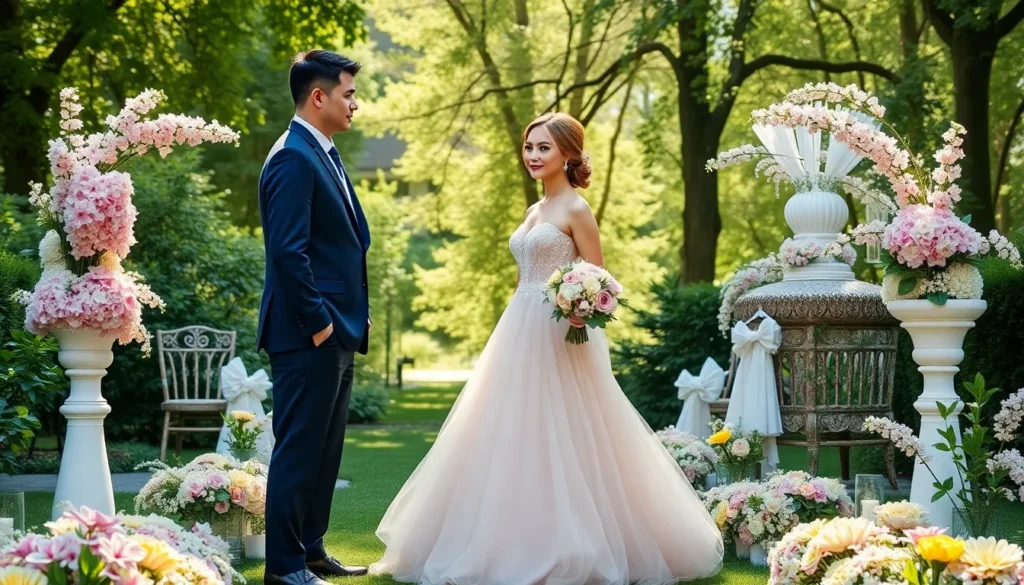
Whether you’re planning an outdoor garden ceremony or an elegant indoor celebration the right color palette sets the foundation for every design decision. We’re sharing our favorite spring wedding color schemes that work across different venues budgets and themes to help you create a cohesive look that feels authentically you.
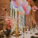
Soft Pastel Palettes for Romantic Spring Weddings
Soft pastels create the perfect foundation for romantic spring weddings, offering delicate hues that mirror nature’s gentle awakening. These tender color combinations photograph beautifully in natural spring light and complement outdoor venues seamlessly.
Blush Pink and Cream Combinations
Blush pink paired with cream delivers timeless elegance that never goes out of style for spring celebrations. We love how this palette creates depth through subtle tonal variations while maintaining sophistication. Bridesmaids look stunning in flowing blush gowns against cream altar arrangements featuring peonies, garden roses, and white hydrangeas.
Centerpieces shine when we incorporate cream linens with blush pink napkins and gold accent pieces. Table settings become more ever-changing with mixed textures like cream ceramic plates paired with blush glassware. Floral arrangements pop against cream backgrounds, especially when we add touches of dusty rose and champagne accents.
Photography benefits tremendously from this palette since cream provides neutral balance while blush adds romantic warmth. We recommend incorporating cream ribbon details on bouquets and blush pink lighting for evening receptions. Cake designs look especially elegant with cream fondant bases decorated with cascading blush sugar flowers.
Lavender and Sage Green Pairings
Lavender combined with sage green brings garden party charm to spring wedding celebrations. This unexpected pairing creates visual interest through complementary cool tones that feel fresh and modern. Bridal parties look effortlessly chic when bridesmaids wear sage green dresses while groomsmen sport lavender pocket squares.
Floral arrangements become conversation starters with this unique color story featuring actual lavender stems, eucalyptus, and white blooms. We suggest using sage green table runners against ivory linens with lavender glassware for sophisticated tablescapes. Outdoor ceremonies benefit from lavender ceremony programs tied with sage green ribbon.
Reception decor gains sophistication when we incorporate both colors through lighting and fabric choices. Lavender uplighting against sage green drapery creates magical ambiance for evening celebrations. We often recommend lavender macarons and sage green menu cards for cohesive styling throughout the event.
Baby Blue and Ivory Arrangements
Baby blue with ivory creates serene elegance perfect for spring garden weddings and outdoor celebrations. This classic combination evokes clear spring skies and fresh beginnings that resonate with couples seeking peaceful romance. Bridal bouquets look particularly stunning with white roses, baby blue delphiniums, and ivory peonies wrapped in silk ribbon.
Table settings become more sophisticated when we use ivory charger plates with baby blue napkins and silver flatware. Centerpieces gain visual appeal through mixed heights featuring ivory candles in baby blue glass votives. We recommend incorporating both colors through linens, with ivory tablecloths and baby blue runners creating layered texture.
Venue decoration opportunities expand significantly with this versatile palette since both colors complement most architectural styles. Baby blue bridesmaids dresses photograph beautifully against ivory ceremony backdrops and natural greenery. Reception lighting becomes more romantic when we add baby blue uplighting to ivory fabric draping throughout the space.
Bold and Vibrant Spring Color Schemes

While soft pastels offer romantic charm, bold and vibrant color schemes can transform your spring wedding into an unforgettable celebration that bursts with energy and personality.
Coral and Peach Statement Colors
Coral serves as the perfect statement color for couples who want warmth without overwhelming brightness. Peach, coral, mint, and champagne create a sophisticated palette that’s ideal for springtime weddings with playful themes. We love how coral adds energy to floral arrangements while maintaining elegance through peachy undertones.
Peach tones complement coral beautifully by softening the overall intensity while keeping the vibrancy intact. Mint green provides a fresh contrast that prevents the warm tones from becoming too dominant. Champagne accents elevate the entire scheme by adding luxurious metallic touches to table settings and decorative elements.
Incorporating these colors works exceptionally well in outdoor venues where natural light enhances their warmth. Coral bridesmaid dresses paired with peach bouquets create stunning visual harmony. We recommend using mint as an accent color in linens and napkins to balance the warmer tones effectively.
Emerald Green and Gold Accents
Emerald green creates dramatic sophistication when paired with complementary colors for March weddings. This rich jewel tone combined with cream, ivory, and blush generates stunning visual contrast that photographs beautifully. Gold accents enhance the luxurious feel while maintaining spring’s fresh aesthetic.
White serves as the perfect backdrop for emerald green’s intensity without competing for attention. Cream and ivory variations add depth while keeping the palette grounded in elegance. We find that blush pink touches soften the boldness while maintaining the scheme’s vibrancy.
Gold metallic elements transform this palette from simple to spectacular through strategic placement in centerpieces and ceremony decor. Emerald green linens with gold charger plates create restaurant quality table settings. Ivory flowers with emerald ribbon details provide cohesive design elements throughout the celebration.
Fuchsia and Orange Pop Combinations
Fuchsia creates incredible impact when combined with softer pink tones for maximum visual interest. Hot pink and fuchsia pops strengthen blush undertones while maintaining spring’s playful energy. This combination is particularly popular during spring wedding season for its bold yet balanced approach.
Orange pairs surprisingly well with pale blue to create unexpected beauty in spring color schemes. Bright orange flowers like tulips and snapdragons incorporate bold color naturally into bouquets and centerpieces. We recommend using orange as an accent rather than a dominant color for best results.
Mustard yellow and cerulean blue offer another vibrant option for adventurous couples. These lively shades energize any spring celebration when used thoughtfully. Orange pops complement both colors perfectly while maintaining the scheme’s cohesive flow throughout ceremony and reception spaces.
Nature-Inspired Earth Tone Palettes

Drawing inspiration from the natural industry around us, earth tone palettes bring a grounded elegance to spring weddings that feels both timeless and contemporary. These sophisticated color combinations, including mocha mousse and sage, offer warm and elegant backdrops that evoke the rich textures and hues found in nature.
Terracotta and Dusty Rose Blends
Terracotta and dusty rose create a romantic vintage atmosphere that’s perfect for couples seeking warmth and sophistication. These earthy hues remind us of sun-baked clay pots and blooming rose gardens, bringing an organic beauty to wedding celebrations. We recommend incorporating terracotta through ceramic centerpiece vessels and accent pieces, while dusty rose can be woven throughout your floral arrangements and bridesmaid attire.
Table linens in cream or ivory provide the perfect neutral backdrop for this palette, allowing the terracotta and dusty rose elements to truly shine. Wooden accents complement these warm tones beautifully, creating a cohesive design that feels both rustic and refined.
Olive Green and Cream Neutrals
Olive green paired with cream neutrals offers a harmonious palette that complements spring’s lush greenery perfectly. This sophisticated combination creates an earthy atmosphere that feels fresh and natural, making it ideal for outdoor ceremonies and garden receptions. We love how olive green foliage arrangements provide rich texture and depth, while cream colored linens and decorative elements add softness and elegance.
Brass or gold accents work wonderfully with this palette, adding subtle warmth without overwhelming the natural beauty of the olive and cream combination. Consider incorporating olive green through eucalyptus garlands, potted herbs, or silk ribbon details that tie the entire look together.
Warm Brown and Blush Combinations
Warm brown tones paired with blush create an inviting ambiance that perfectly captures the essence of spring’s sun-kissed days and blossoming flowers. This palette evokes feelings of comfort and romance, making guests feel welcomed and cherished throughout your celebration. We suggest incorporating warm brown through wooden ceremony arches, farm tables, or rustic signage that adds organic texture to your design.
Blush elements can be introduced through delicate floral arrangements, soft fabric draping, or bridesmaid dresses that photograph beautifully in natural spring light. This combination works exceptionally well for barn venues, garden parties, or any celebration where you want to create a cozy yet elegant atmosphere.
Classic Spring Floral Color Combinations

Classic spring blooms offer timeless inspiration for wedding palettes that capture the season’s natural beauty. These traditional combinations blend romantic florals with complementary tones to create sophisticated, garden-inspired celebrations.
Daffodil Yellow and White Pairings
Daffodil yellow paired with clean white creates a bright, cheerful palette that perfectly captures spring’s renewal and joy. We love how this combination brings sunshine to outdoor ceremonies and garden receptions with its fresh, lively energy. Bridesmaid dresses in sunny yellow complement crisp white bridal gowns beautifully, while this palette works exceptionally well for morning or afternoon celebrations.
Incorporating these colors into your wedding design offers endless possibilities for vibrant arrangements. Yellow bouquets featuring daffodils, tulips, or ranunculus against white peonies create stunning focal points for ceremony backdrops. Table settings shine with yellow napkins, white linens, and matching centerpieces that photograph beautifully in natural light. We recommend adding touches of greenery to ground the brightness and create visual balance throughout your venue.
Cherry Blossom Pink and Green Accents
Cherry blossom pink brings delicate romance to spring weddings when balanced with various shades of fresh green foliage. This palette ranges from soft blush to deeper rose tones, offering flexibility for different wedding styles and venues. We’ve seen couples use this combination to create natural, garden-inspired celebrations that feel both elegant and organic.
Green accents enhance the freshness of pink blooms through moss, eucalyptus, or olive foliage in floral arrangements. Table settings benefit from sage green runners paired with blush pink napkins and rose-colored centerpieces. Bridesmaids look stunning in varying shades of pink while groomsmen complement the palette with green boutonnieres or accessories. This combination works particularly well for outdoor venues where natural greenery can extend the color story seamlessly.
Tulip Purple and Soft Gray Schemes
Tulip-inspired purple ranging from lilac to deep violet pairs elegantly with soft gray for a modern, sophisticated spring palette. This trending combination offers subtle contrast and remarkable adaptability for both indoor and outdoor wedding venues. We appreciate how this scheme brings contemporary refinement while maintaining the fresh spirit of spring celebrations.
Gray table linens, chairs, and stationery provide the perfect neutral backdrop for vibrant purple florals and bridesmaid gowns. Purple tulips, lavender, and amethyst-colored blooms create stunning arrangements against gray ceremony backdrops or reception settings. This palette photographs beautifully in various lighting conditions and allows for creative interpretations through different purple intensities. Adding silver or pewter accents enhances the sophisticated atmosphere while maintaining the palette’s modern appeal.
Fresh and Airy Light Color Palettes

These ethereal color combinations capture spring’s gentle essence while creating a sophisticated atmosphere. Light, airy palettes offer versatility for modern couples seeking elegance without overwhelming their celebration.
Mint Green and Champagne Tones
Mint green creates a soothing foundation that pairs beautifully with champagne for an elegant spring wedding palette. This combination works exceptionally well when enhanced with other pastel hues, adding depth and visual interest to your celebration. We recommend incorporating dark olive or emerald green accents to introduce contrast and sophistication, while champagne tones provide subtle warmth and luxury throughout your venue.
Champagne elements can be woven into your table settings through metallic chargers, glassware, and candle holders. Mint green florals like eucalyptus, succulents, and pale green hydrangeas complement this palette perfectly. The versatility of these colors allows you to customize the look for vintage, modern, or shabby chic wedding themes.
Powder Blue and Silver Accents
Powder blue serves as a classic spring color that transforms beautifully when paired with silver accents for a contemporary feel. This cool combination adds a modern twist to traditional spring themes while maintaining an elegant and polished appearance. Silver metallic elements can be highlighted through vases, silverware, and table runners, creating stunning visual impact for both indoor and outdoor settings.
We love how this palette photographs in natural light, especially during golden hour ceremonies. Powder blue works wonderfully in bridesmaid dresses, napkins, and floral arrangements, while silver accents can appear in jewelry, cake decorations, and lighting fixtures. The combination creates a serene atmosphere that feels both fresh and timeless.
Soft Yellow and White Combinations
Soft yellow reminds us of spring’s first blooms and pairs beautifully with white or ivory for a cheerful, uplifting palette. This combination works particularly well for morning ceremonies and garden weddings, creating a bright and welcoming atmosphere. Yellow can be incorporated through seasonal flowers like daffodils, tulips, and ranunculus, while white keeps the overall aesthetic light and airy.
We suggest using soft yellow in table linens, centerpiece accents, and stationery details rather than overwhelming the space. White or ivory serves as the primary neutral, appearing in your gown, ceremony backdrop, and major floral arrangements. This palette photographs beautifully against natural greenery and creates an optimistic mood that guests will remember long after your celebration.
Elegant Jewel Tone Spring Palettes

Jewel tones bring luxurious depth to spring weddings while maintaining the season’s fresh appeal. These rich, sophisticated color combinations create stunning visual impact that photographs beautifully against spring’s natural backdrop.
Amethyst Purple and Rose Gold
Amethyst purple delivers regal sophistication that transforms any spring celebration into an upscale affair. Rose gold accents add warm metallic shimmer that feels both modern and romantic, creating the perfect balance with purple’s vibrant intensity. We recommend incorporating purple blooms like lavender or deep tulips tied with rose gold ribbons for ceremony arrangements. Table settings shine when you combine amethyst linens with rose gold chargers and candelabras. This palette works exceptionally well for evening receptions where the metallic elements catch and reflect ambient lighting. Bridesmaids look stunning in flowing amethyst gowns accessorized with rose gold jewelry and shoes.
Sapphire Blue and Cream Neutrals
Sapphire blue creates striking elegance that pairs beautifully with soft cream neutrals for timeless appeal. This jewel tone evokes calm sophistication while cream balances the richness with warmth and lightness. Garden ceremonies benefit from sapphire blue ceremony arches adorned with cream colored flowers like peonies or garden roses. Reception tables look refined with deep blue linens complemented by cream napkins and centerpieces. We suggest incorporating sapphire in bridesmaid dresses while using cream for floral arrangements and cake decorations. This versatile combination works equally well for daytime garden parties and elegant evening celebrations.
Emerald and Blush Pink Contrasts
Emerald green brings natural richness that contrasts beautifully with delicate blush pink for bold yet romantic appeal. This vibrant jewel tone captures spring’s lush freshness while blush pink adds softness and femininity to balance the intensity. Floral arrangements featuring emerald greenery paired with blush roses or peonies create stunning visual interest. We recommend using emerald for larger decor elements like table runners or backdrop draping while incorporating blush through bouquets and smaller accent pieces. This green and pink combination photographs exceptionally well in outdoor settings where natural light enhances both colors. Wedding attire looks sophisticated when emerald bridesmaid dresses are paired with blush bouquets and matching accessories.
Trendy Modern Spring Color Schemes

Modern spring weddings in 2025 embrace both contemporary sophistication and timeless elegance. These trending color combinations reflect the season’s fresh energy while incorporating the year’s most sought-after hues.
Millennial Pink and Gray Combinations
Millennial pink paired with dusty gray creates one of the most requested modern spring palettes we’re seeing this year. This combination offers a fresh and airy feel that’s perfect for contemporary celebrations, balancing warmth with sophistication. Couples love how pastel pink brings romance while gray adds modern stability to their overall aesthetic.
Metallic accents transform this already stunning duo into something truly extraordinary. Silver or gold touches through table settings, invitation details, and jewelry create layers of elegance that photograph beautifully in natural spring light. The soft peach variation with gray provides a warmer alternative that complements spring’s blooming flowers and fresh greenery perfectly.
Sage Green and Terracotta Pairings
Sage green and terracotta represent the earthy elegance that’s defining spring weddings in 2025. This combination brings warmth and coziness to celebrations while maintaining that fresh spring feeling couples crave. Sage works beautifully in foliage arrangements and table runners, while terracotta adds rustic charm through pottery, linens, and accent pieces.
Gold accents elevate this earthy pairing to luxury status without overwhelming the natural beauty. Incorporating golden candlesticks, charger plates, or subtle jewelry pieces enhances the organic feel while adding that touch of glamour every couple wants. This palette works exceptionally well for garden venues and outdoor celebrations where natural elements can shine.
Dusty Blue and Mauve Blends
Dusty blue and mauve create the soft, romantic atmosphere that makes spring weddings truly magical. These gentle hues evoke the whimsical feeling of springtime while maintaining sophisticated elegance throughout the celebration. We love how this combination photographs in both natural outdoor light and romantic evening settings.
Balancing these soft colors with white or gold accents prevents the palette from feeling too muted. White brings crisp freshness that highlights the subtle beauty of both blue and mauve, while gold adds warmth and luxury. Adding pastel pink or soft peach creates additional depth that enhances floral arrangements and creates stunning layered table settings.
Garden Party Inspired Color Palettes

Garden party weddings capture the essence of spring’s natural beauty through carefully curated color combinations. We’ve selected these palettes to create the perfect outdoor celebration atmosphere.
Peony Pink and Eucalyptus Green
Peony pink brings a fresh and lively feel to spring garden parties when paired with eucalyptus green’s vibrant natural tones. This combination captures the whimsical charm of blooming gardens while maintaining sophisticated elegance. Soft pink peonies create stunning centerpieces alongside eucalyptus branches, while bridesmaids can carry bouquets featuring both colors for visual continuity.
Table linens in cream or white allow the peony pink napkins and eucalyptus green runners to take center stage. Ceremony arches draped with eucalyptus garlands and peony pink fabric create romantic focal points. Wedding cakes decorated with sugar peonies and fresh eucalyptus leaves complete this natural ambiance perfectly.
Hydrangea Blue and Cream Tones
Hydrangea blue adds elegant sophistication to garden celebrations while cream tones provide warm and inviting contrast. This palette creates a serene garden party atmosphere that photographs beautifully in natural outdoor lighting. Blue hydrangeas serve as stunning focal flowers in bridal bouquets and tall centerpiece arrangements.
Cream colored table settings allow the hydrangea blue elements to pop without overwhelming the design. Wooden farm tables complement this palette beautifully, especially when adorned with cream runners and blue ceramic accents. String lights overhead enhance the romantic garden ambiance as evening approaches.
Rose and Greenery Combinations
Roses in peach or blush tones paired with lush greenery like ferns or succulents create romantic and lush garden settings. This versatile combination works exceptionally well for couples seeking timeless elegance with natural elements. Cascading rose arrangements mixed with trailing greenery transform ceremony spaces into enchanted gardens.
Bridal bouquets featuring garden roses surrounded by eucalyptus, ferns, and succulents offer texture and visual interest. Reception tables benefit from low rose and greenery arrangements that encourage conversation while maintaining the garden theme. Arch installations combining climbing roses with various green foliage create breathtaking ceremony backdrops.
Rustic Spring Wedding Color Ideas

We’ve curated rustic color palettes that blend natural elements with spring’s fresh beauty, creating warm and inviting atmospheres perfect for barn venues and outdoor celebrations.
Dusty Rose and Burgundy Accents
Dusty rose creates a warm and romantic foundation that pairs beautifully with rich burgundy accents for sophisticated rustic charm. This vintage-inspired pink tone offers softness while deeper burgundy elements like table runners, bouquet ribbons, or groomsmen ties add dramatic depth. Floral arrangements featuring dusty rose peonies and burgundy dahlias create stunning centerpieces that photograph beautifully against wooden tables.
Bridesmaid dresses in dusty rose complement burgundy boutonnieres and accent flowers, while burgundy linens paired with dusty rose napkins enhance the romantic atmosphere. Wedding cakes decorated with dusty rose buttercream and burgundy sugar flowers complete this cozy yet elegant palette perfectly.
Cream and Wood Brown Tones
Cream provides a soft neutral base that pairs naturally with warm wood brown tones for an authentic rustic feel. This earthy combination emphasizes organic beauty through natural materials like reclaimed wood tables, tree slice centerpieces, and vintage wooden signs. Cream linens and napkins create elegant contrast against rich brown wooden elements throughout the venue.
Bridal party attire in cream dresses with brown leather accessories captures the palette’s natural essence, while cream roses mixed with brown branches and twine create rustic bouquets. Ceremony decor featuring cream fabric draping on wooden arches enhances the organic simplicity that defines rustic spring weddings.
Sage and Copper Combinations
Sage green brings fresh spring foliage vibes while copper metallics add warmth and sophisticated shimmer to rustic celebrations. This balanced palette combines nature’s calming green tones with metallic elements that elevate the overall design aesthetic. Sage linens paired with copper charger plates and candlesticks create elegant table settings with rustic charm.
Copper lanterns and fairy lights provide romantic lighting that complements sage bridesmaid dresses beautifully. Floral arrangements featuring sage eucalyptus and white blooms in copper vessels create stunning centerpieces, while copper wire wrapped around bouquet stems adds metallic touches that tie the palette together seamlessly.
Tips for Choosing Your Perfect Spring Wedding Palette

Creating the perfect spring wedding color palette requires thoughtful consideration of several key factors. We’ll guide you through essential strategies that ensure your chosen colors enhance every aspect of your celebration.
Consider Your Venue and Season
Venue selection significantly impacts your color palette decisions, as outdoor garden venues pair beautifully with soft pastels and floral-inspired combinations. Indoor spaces benefit from more vibrant or textured colors that enliven the atmosphere and create visual interest. Garden settings naturally complement dusty blue with peach combinations, while barn venues enhance the appeal of sage green and copper metallic pairings.
Spring’s natural ambiance should guide your color selections, with early spring favoring lighter pastels like pale pink and sky blue. Late spring celebrations can accommodate bolder combinations such as coral and peach or emerald green with cream accents. Seasonal timing affects flower availability, making it essential to align your palette with blooms that’ll be at their peak during your wedding month.
Balance Bold and Neutral Tones
Harmony emerges when you mix bold hues with neutral foundations, preventing overwhelming visual experiences while maintaining celebratory energy. Lively yellow or orange accents paired with ivory or beige bases create sophisticated balance that photographs beautifully. Fuchsia and orange combinations work exceptionally well when grounded with champagne or cream neutrals.
Textured neutrals like champagne and ivory provide elegant foundations that allow statement colors to shine without competition. Mint green and champagne pairings exemplify this balance, offering fresh aesthetics while maintaining refined sophistication. Neutral bases also provide flexibility for incorporating metallic accents like rose gold or copper that elevate the overall design.
Incorporate Seasonal Flowers and Elements
Seasonal blooms should directly influence your color palette choices, with tulips, daffodils, peonies, and lilacs serving as natural inspiration sources. Cherry blossom pink balanced with fresh green accents creates romantic garden-inspired celebrations that feel authentically spring. Daffodil yellow paired with white captures the season’s bright, cheerful essence perfectly for outdoor ceremonies.
Floral elements extend beyond bouquets into centerpieces, ceremony arches, and reception decor that reinforce your chosen palette throughout the venue. Peony pink with eucalyptus green combinations create whimsical elegance in both fresh arrangements and decorative accents. Hydrangea blue combined with cream tones establishes serene garden party vibes that feel naturally cohesive across all wedding elements.
Conclusion
We believe that choosing the perfect spring wedding color palette is one of the most exciting parts of planning your special day. The combinations we’ve shared offer endless possibilities to express your unique style while embracing the season’s natural beauty.
Remember that the best palette is one that resonates with you as a couple and complements your venue choice. Whether you’re drawn to soft pastels for their romantic appeal or bold jewel tones for dramatic impact your colors should tell your love story authentically.
We encourage you to experiment with different combinations and consider how they’ll photograph in your chosen setting. Spring weddings offer the perfect backdrop for creating stunning visual memories that you’ll treasure for years to come.
Frequently Asked Questions
What are the best spring wedding color palettes for 2025?
The top spring wedding color palettes for 2025 include millennial pink with dusty gray, sage green with terracotta, and dusty blue with mauve. These modern combinations offer contemporary sophistication while maintaining timeless elegance. Soft pastels like blush pink and cream remain popular for romantic themes, while bold jewel tones like amethyst purple with rose gold add luxurious depth to spring celebrations.
How do I choose colors that photograph well for my spring wedding?
Choose colors with good contrast and natural light compatibility. Soft pastels like blush pink, lavender, and baby blue photograph beautifully in spring’s natural lighting. Bold colors like coral, emerald green, and sapphire blue create stunning visual impact in photos. Avoid overly saturated colors that may appear harsh, and balance vibrant hues with neutral tones like cream, ivory, or champagne for optimal photo results.
Can I use bold colors for a spring wedding, or should I stick to pastels?
You can absolutely use bold colors for spring weddings! Vibrant combinations like coral and peach, emerald green with cream, or fuchsia and orange create unforgettable celebrations. The key is balancing bold hues with neutral tones and incorporating them thoughtfully through florals, decor, and accents. Bold jewel tones like sapphire blue and amethyst purple add luxurious sophistication while maintaining spring’s fresh appeal.
What color combinations work best for outdoor spring ceremonies?
For outdoor spring ceremonies, consider nature-inspired palettes that complement the natural setting. Sage green with cream, olive green with blush, and eucalyptus green with peony pink work beautifully. Classic spring florals like daffodil yellow with white or cherry blossom pink with fresh green create garden-perfect atmospheres. These combinations enhance rather than compete with spring’s natural beauty.
How can I incorporate seasonal flowers into my wedding color scheme?
Use seasonal spring blooms as color inspiration for your palette. Tulips inspire purple and gray combinations, daffodils suggest bright yellow and white schemes, and cherry blossoms offer pink and green palettes. Incorporate these flowers directly into centerpieces, bouquets, and ceremony decor. Match your linens, bridesmaid dresses, and other elements to complement the natural colors of your chosen seasonal blooms.
What are some budget-friendly ways to implement my chosen color palette?
Focus on high-impact, low-cost elements like linens, candles, and DIY centerpieces in your chosen colors. Use seasonal flowers which are typically more affordable and readily available. Incorporate your palette through paper goods, ribbons, and small decor accents rather than expensive floral arrangements. Paint or spray-paint existing items to match your color scheme, and ask bridesmaids to wear dresses in your palette colors.
Should my spring wedding colors match my venue’s existing decor?
Your colors should complement, not necessarily match, your venue’s existing decor. For rustic barn venues, earth tones like dusty rose with burgundy or sage green with copper work well. Garden venues pair beautifully with soft pastels and nature-inspired palettes. Indoor spaces with neutral backgrounds allow for bolder color choices. Consider the venue’s natural lighting and architectural elements when selecting your palette.
How many colors should I include in my spring wedding palette?
Limit your palette to 3-4 main colors for the most cohesive look. Typically, choose one or two primary colors, one neutral (cream, ivory, or gray), and one accent color for pops throughout your decor. Too many colors can create visual chaos and make coordination difficult. Stick to different shades and tones within your chosen color families to add depth while maintaining harmony throughout your celebration.